In my post Thinking about Time and Space I referred to the spatial turn in history, as a movement that occurred in the 1970s and 1980s and looked for a stronger interest in space, in an effort to understand society and culture. I will quote geographer Edward Soja once again, to stress that:
“Rather than being a seem only as a physical backdrop, container, or stage to human life, space is more insightfully viewed as a complex social formation, part of a dynamic process.”
We could further discuss the social construction of space, and the difference between space and place, as has been argued by different geographers and philosophers, such as [Doreen Massey] (http://news.aag.org/2016/03/in-memoriam-doreen-massey/), Edward Relph, Yi-Fu Tuan, but for the purposes of this post I would like to talk of a hands on experience with QGIS. I already talked a bit about Geographic Information Systems in a previous post (LINK), but I would recall here some of its basis, so as to frame the work I have done. GIS is software that captures, stores, manages, displays, and analyzes information linked to a location on earth. GIS can relate different types of data - quantitative, textual, image, audio - to each other based on their shared location. It also allows a visualization of these relationships on a map of the geographical space in which they all occur. QGIS is a free and open source geographic information system. I used that tool for my hands on experience, and that is what I am moving to now.
What to map?
Last summer I started a collaborative research project with Prof. Paulina Alberto, from the History department at the University of Michigan. The project is about a very popular Afro Argentinian man from the beginning of the twentieth century, Raul Grigera, better known as El Negro Raul. Paulina collected a variety of texts that narrate episodes in the life of Raul. Her corpus now includes cartoons, photographs, newspaper and magazine articles, films, plays, novels, short stories, poems, memoirs, political propaganda, histories, and song lyrics from the early 1900s to the present. The worked I developed during the summer was applying distant reading techniques to her corpus, and to learn whether and how these techniques can provide new ways of getting at the questions about history, race and narrative in twentieth century Argentina. One of the interesting findings was realizing that the press articles before 1930 were referring to different points of the city of Buenos Aires in a way that showed the familiarity that the readers of these journals, magazines and newspapers had with them. For instance, when an article mentioned that Raul was seen at ”un cafe en la calle Corrientes” [a cafe in Corrientes street - a very popular street of the center of the city of Buenos Aires], it didn’t need to provide any further explanation about the location of that place. On the contrary, the press articles that appeared after 1930 did include further details about the different locations, places and streets they were referring to. That aspect called our attention, and we started thinking about the distribution of these journals, magazines and newspapers across time. Our initial hypothesis was that as long as the country became populated in different areas that weren’t just Buenos Aires or Cordoba (the two most important provinces by the beginning of twentieth century), these publications started being distributed across the country, therefore having a new audience. These new readers may not be familiar with the different places in the city of Buenos Aires so a detailed explanation of its location was necessary. Having this idea in mind, I though that it would be interesting to map the population growth in twentieth century Argentina and how it was distributed across the different provinces. That is where QGIS enters in action.
Getting started with QGIS
Before tackling QGIS I became familiar with Google Maps, Google Earth, and I played a bit around with Carto and Mapbox. Nevertheless, for my purposes I decided that I will try QGIS as it will allow me to include different layers and to join them with the map so as to see the different demographic statistics across time. I first needed to download the system, and to install it. That could be a little bit tricky so I followed the documentation that appears in the [QGIS site] (http://www.qgis.org/en/docs/index.html). It helped me a lot. After successfully downloading and installing the software, I got started with the mapping aspect. Again, I followed a set of tutorials that were super useful, since although what we may think, in QGIS we are not really working with a map but with data that you need to get from different sources. My first challenge was to find a shapefile for the country of Argentina. I got it from Global Administrative Areas. I then had to find my other data, that is the demographic statistics. After searching a bit I found it but in a format that of course wasn’t the appropriate one for QGIS. The tables I needed to upload had to be in .cvs format, so I first copied the data in a spreadsheet, selected the one I needed, created a new file with that data only and saved is as comma separated values. It worked. I uploaded it in QGIS (again, the tutorial really helps you), joined and styled and I had my first map! Second challenge Spanish language includes accents and special characters and that may be a potential problem when transforming your sources into data for any computational analysis. It certainly was this time. The map had the names of the provinces with accent, and my table with the population rates had it too, but when I saved it as cvs, these letters were not recognized as such. I cleaned my data by removing the accents, but when I linked the column with the name of the provinces from the map to the column with the name of the provinces from the table, there were some provinces that appeared with Null values, as the names didn’t match. Therefore, that is what I got in my first attempt:
Solution I added a third column to my table that numbered the provinces, as I knew that the map had a column with the numbers of the provinces. I used these two columns as the link between the two files. And it got fixed:
Outcomes
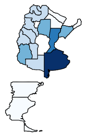
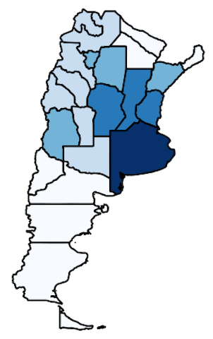
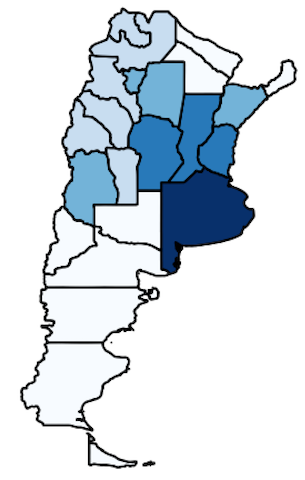
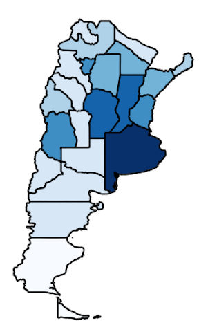
I initially mapped two different years: 1918 and 1960. Although there were changes in the population distribution, it wasn’t visually explicit in the maps (at least for me), so I decided to add some more years and to have a bigger time spam. I am including below the maps with the population distribution that I created:
1903:
1918:
1930:
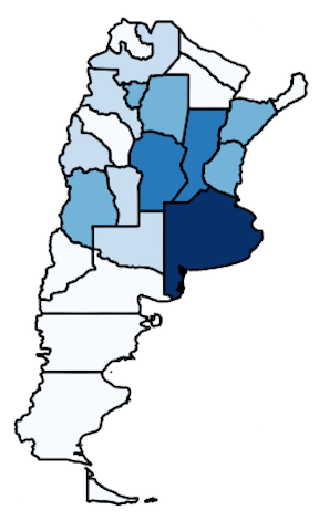
1960:
1980:
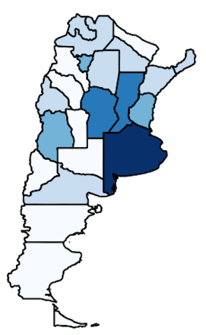
As we see, the country was populated throughout the twentieth century and although Buenos Aires remained as the principal province in terms of population, the rest of the provinces started to growth in number across the decades. That would explain the change that the press articles showed in the reference of the places that Raul Grigera moved during the first decades of the twentieth century.
What next?
I found QGIS very valuable in connecting different data to a map (that is data too!) and to be able to visualize it. It was my initial experiment and I’m sure it could have gone better in many ways but it served me to get familiar with the system and to explore the many possibilities that it has (which are really really a lot). I’ll keep playing around with it, now thinking in mapping the places that these articles mention, in which Raul was seen. I would like to connect his mobility to the one that was thought for the different groups by the beginning of twentieth century Argentina. Raul accompanied the sons of the elite in their nocturnal activities, and that would explain his access to many places that were implicitly forbidden for most of the Afro Argentinian population. I look forward to finding new insights by having these places mapped.
... Back to top ...